Spearheading Xively's complex and ambitious redesign
September 21, 2013 — 8 min read
From joining as the first Front end Developer in the team to leading the ambitious redesign of the most popular Internet of Things platform.
Xively is a subsidiary of LogMeIn (LOGM : NASDAQ), and is the industry’s first public cloud, purpose-built for developing and managing commercial products on the Internet of Things. It simplifies the interconnection of devices, data, people and places, accelerating the creation of compelling connected products.
Pachube and Cosm
When I was hired in 2011, I was the first Front End Developer to join the team. The company was then known as Pachube and was at that time the world’s largest Internet of Things open data repository and community. I had just moved to London from Lisbon, Portugal, after a 2 year stint at Portugal Telecom’s web team. Initially I was tasked with building the API documentation website and I was excited to include new HTML5 goodies like the History API to make the experience as seamless and easy as possible.
After just a couple of months, the whole team started working on rebranding and redesigning as Cosm. My role in this effort was to single-handedly develop the entire front end, which included a completely new marketing site and device management interface, and also a redesign of the documentation site.
The design of the Cosm identity and user interface was done remotely by LogMeIn’s design team in Boston but as the work progressed, I began to be included in the design discussions. This was mainly due to the London team picking up on my design skills and sensitivity, and taking the steps to get me in the design discussions.
Once the interface designs were signed off, I built a custom UI toolkit from scratch called CosmUI. The toolkit was organised in order of complexity of the UI elements: Grid, Elements, Components, Objects and Layouts. This organisational model was not standard back then — other toolkits that were coming out were organised in classes of elements rather than by complexity — and this proved to be a very good decision in what concerned scalability and maintainability. The backend team and I worked immensely hard to get it out by the deadline and we did so on May 2012. The redesign was well received in international media.
The Xively Redesign
In early January 2013, I was tasked with leading both the design and front end development of a complete rebrand and redesign from Cosm to Xively due to trademark issues. This was a massive challenge with an ambitious deadline — 4 months to pull it off, which we did — and it was a unique experience from which I learned many valuable lessons.
Identity
We tackled a lot of the parts in tandem but for the sake of structure, I’ll cover identity first and move down the waterfall. For the Xively identity, we took a fair amount of time to dive deep in thinking about the brand persona, the values and the principles we’d follow later on when we’d need to make tough design decisions.
The identity benefited greatly from being designed in parallel with the user interface because, as we applied it, we found some adjustments had to be made to accommodate that important context.
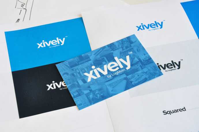
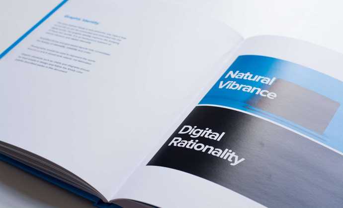
At the end of the identity process, we designed a brand book that contained not only guidelines to follow but also reflections on the ambitions and thinking behind the brand, with the goal to inspire rather than constrain any designers that would use it later on.
User Experience
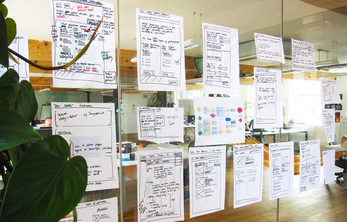
Initially, we took time to research the product’s personas and find out their needs to make better informed decisions. With those in hand, we moved on to user testing to dig up problems the previous platform had for those different personas.
I truly believe in jumping quickly into prototyping to experience the product in its final context.
Armed with a good amount of research, we created wireframes for the most important parts of the device management interface, as well as the flows to connect them. As those were refined, we built prototypes of the interface to test if the patterns we came up with worked well and quickly iterate to improved versions. I truly believe in jumping quickly into prototyping to experience the product in its final context.
One of the trickiest challenges we faced was transitioning legacy users over to an entirely new interface. We had to make difficult decisions that balanced both the user needs and the core business goals this redesign had to achieve. In a post-launch analysis, any transition experience feedback we tried to gather was overshadowed by negative feelings towards the pricing strategy change to a paid service.
We spent a lot of energy crafting an immersive onboarding process that would provide not only an overview of the interface but of the service provided as well. This was achieved by giving users the chance to do what we called a test drive. The user went through using the interface to create a data feed and going to a website on their phone. We used the analogy of tracking the health of a package you ordered online — using the phone’s movement sensors, Xively would tell you if the package (your phone) had tumbled above a threshold that considered it to be damaged, in real-time. This showed some essential functionalities of the service from a business perspective, solving a real-world logistics problem.
User Interface
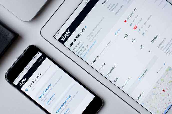
The challenges in designing the user interface were some of the most difficult and complex I had faced so far in my career and the deadline was very aggressive. The redesign encompassed a device management platform, a documentation website, a marketing website and finally a blog.
We made it a point that no features would be out of reach for any screen size.
The device management platform was designed following a strict set of principles that we outlined before we got started:
- Xively is a tool, fulfilling its function is the primary goal.
- Xively is invisible, it is unobtrusive.
- Xively is accurate, it must be honest and complete.
- Xively is coherent, it is logical, and aesthetically consistent.
- Xively is all that is necessary, nothing more.
These principles heavily influenced the design decisions we made regarding the device management interface. For example, to follow the accuracy principle we had to make sure that all data was presented in its entirety, avoiding rounding numbers, averaging or ellipsis. We also took the last principle to heart and created an interface where you had all the features you needed to manage a device without ever needing to go anywhere else or open another window — and we refrained from adding any superfluous information or decoration.
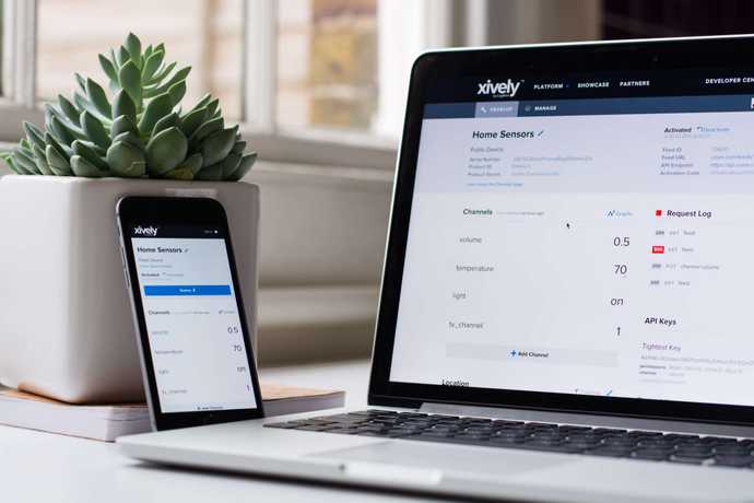
All of the interfaces were designed to work across all screen sizes. This was made possible by carefully crafting a design system that had responsiveness built in right from the start. A method we used was to always start from the most constrained environment, the smartphone, and grow every element to its most complex state in the least constrained, the big screens. We made it a point that no features would be out of reach for any screen size, we were well aware that our users to could not be easily segmented into distinctly defined contexts of usage.
Front End Development
As we designed the user experience and interface, we quickly started building a prototype of the device management application. As I mentioned before, I believe that going quickly into prototyping is the only way to properly judge the experience of a product. This kind of approach comes with a tension in how quickly versus how well to code the prototype. Fortunately, if you happen to be leading both design and front end, as I did, you have the benefit of managing this tension and balance the tension better.
The UI library was key to meeting the deadline.
We built a custom UI library with all the elements, modules and page-specific styles that were present in the user interface designs. This was beneficial in many ways, it was highly maintainable and scalable and it allowed the team to create pages much faster without my help. The UI library was key to meeting the deadline.
The device management application was the most challenging part of the front end, not just due to the sheer volume of work it entailed but also by the ambitious user experience we had designed. We used Backbone.js to handle the complexity of the modules’ behaviour and to make it easy to work with all the data going back and forth. The modules were developed in conjunction with the backend team to knit them tightly with the RESTful API.
As a side project, I built a Javascript library for Xively’s API which later on was adopted as the official library. This came out of hack days and side projects where I’d get an Arduino to exchange data with a web application.
In just four months, we created a brand, designed its user experience and interface, and developed the front end as well. I’m incredibly proud of what we achieved together as a team.
Awards
- Best in Show / ARM TechCon 2013
- Best M2M Solution / CTIA’s MobileCon 2013
- Best Enabling Technology / 2013 M2M Battle of the Platforms
Press
- ReadWrite / Xively Actually Connects Things In The Internet Of Things
- GigaOM / LogMeIn and ARM want to help you build the internet of things
- Computerworld Australia / Xively: LogMeIn’s new IoT cloud play
- Information Age / We’re the Amazon Web Services of the Internet of Things, says Xively
- The Inquirer / ARM collaborates with Logmein to launch Xively cloud service
- The Register / LogMeIn dives into cloudy things with ARM support
Thank you for reading.
Designing and developing an Internet of Things search engine →